brand / website / photography
Turnbull Engineering
They may be a young firm, but with 80+ staff they definitely weren't small. Their challenge was being perceived as 'the little guys' when up against well established firms. We set about making them feel 'big'.

Looking at their old logo and website it was little wonder they weren't being taken seriously. With Turnbull sponsoring an upcoming major event, Creature was set an ambitious target of overhauling the brand and website in six weeks.
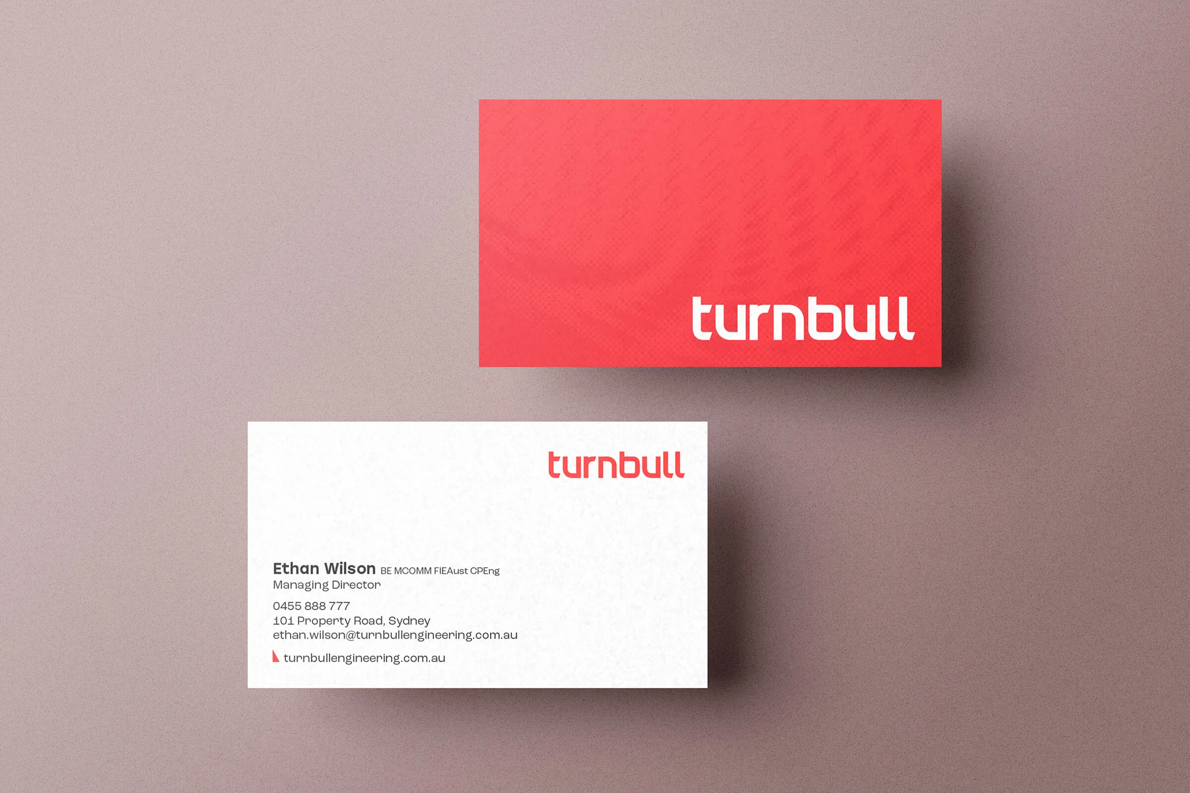
Our first step was understanding the value Turnbull delivers for their clients. This was distilled into the 'Your Engineering Edge' value proposition which went on to influence the look and feel of the brand, with 30 degree angles featured amidst a bold electric red colourway. The typography within the logo also took inspiration, with geometric letterforms featuring angular details, tying it all together.


Photography
Like so many engineering firms we've worked with, it can be a challenge depicting what they do. In Turnbull's case, it's also kind of visually monotonous – there's only so many roads you can show before every case study looks the same.
As such, we decided to focus on the human side of the organisation, depicting a vibrant organisation full of approachable faces.


We also wanted to make their headshots unique. An acute crop and whisp of electric red works to make the team look a million dollars despite being shot against a white wall amongst office cubicles.


